Problem — boaters face range anxiety and limited real-time safety visibility.
.svg)
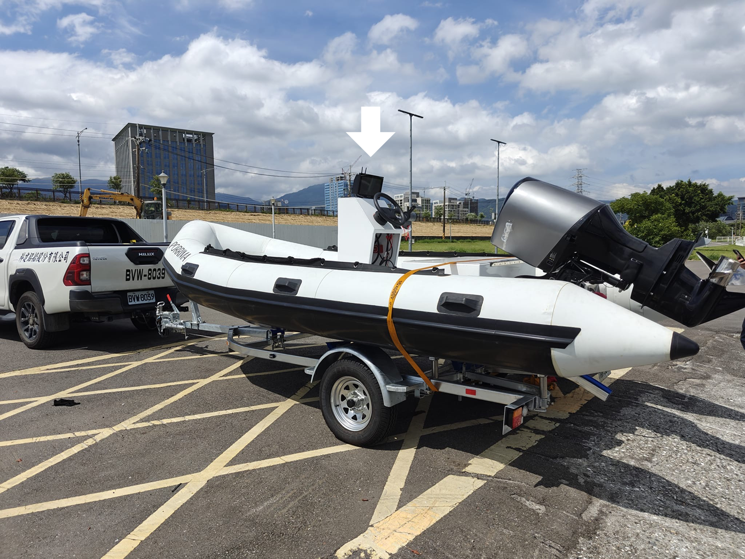
marine human-machine interface display
8 min read
.svg)
.png)
Documentation — PRFAQ, PRD, TRD, stakeholder/ customer demos
UX — user/ market research + user flow + product/user testing
UI — wireframing/ prototyping + design systems + micro interactions
Me — Product Designer
David Yan — PM
David Shi — Lead SWE
Ivan Lui — HWE
Harris Das — SWE
Muhammad ur Rehman — SWE
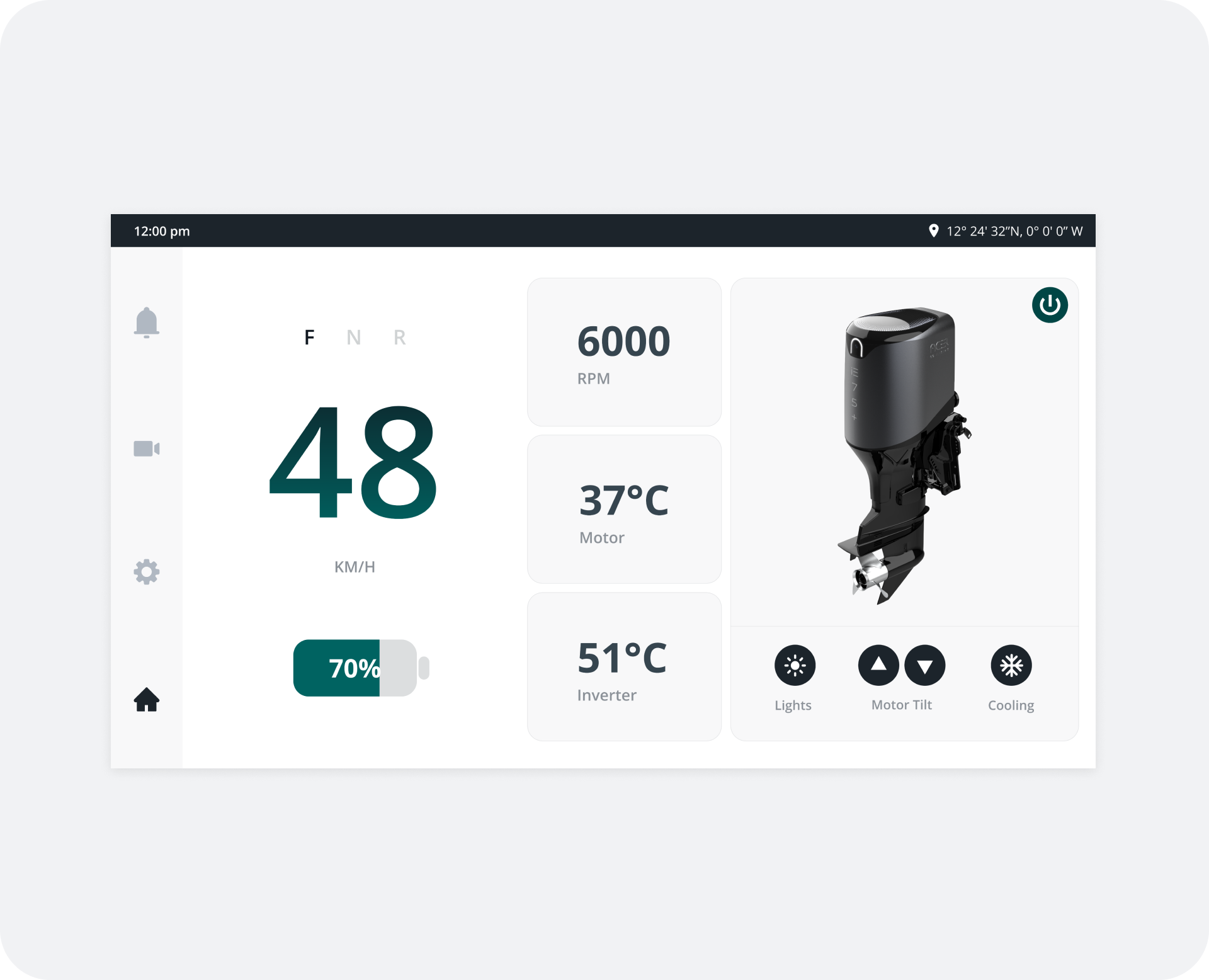
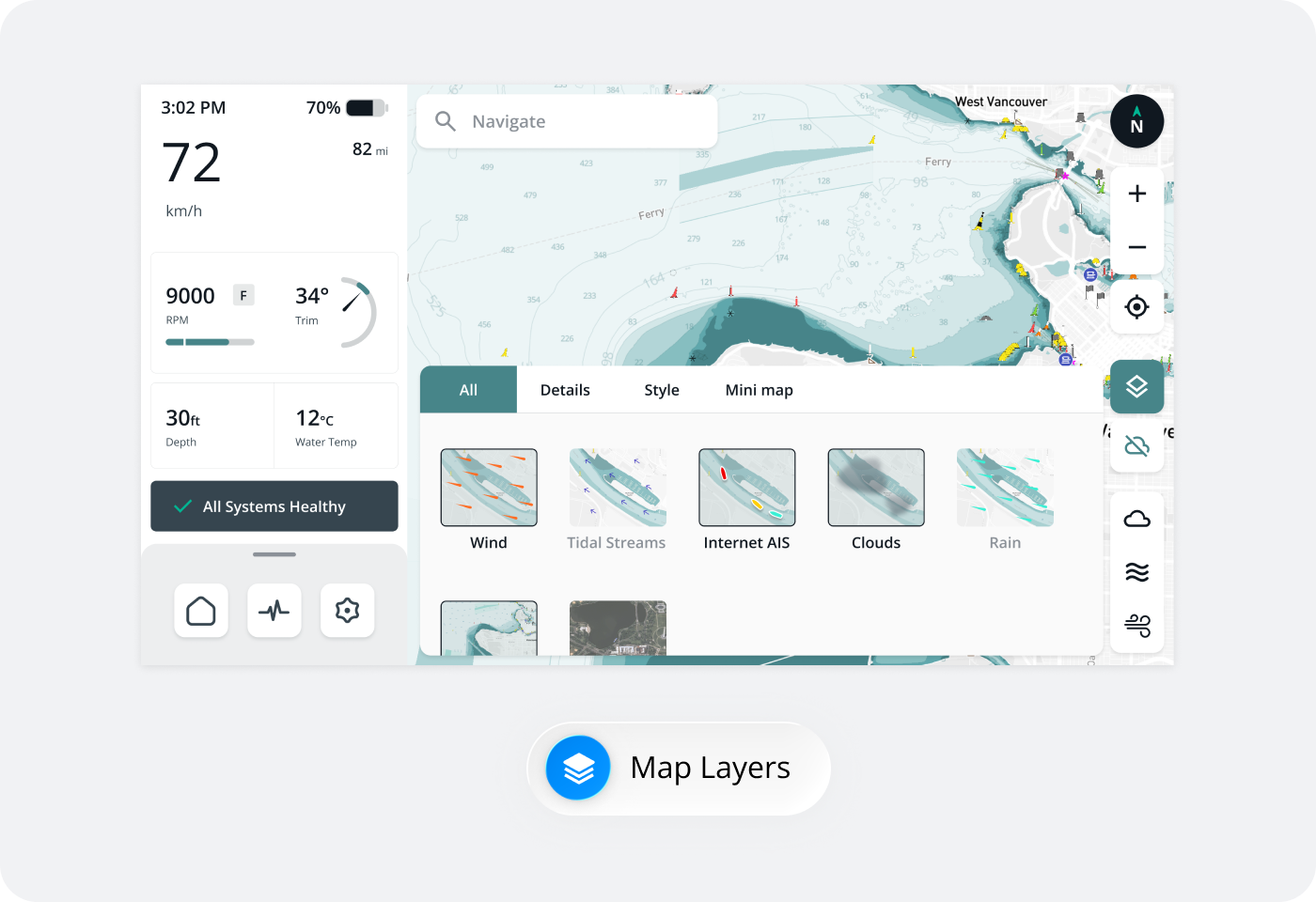
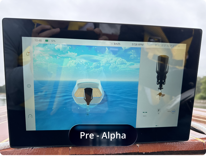
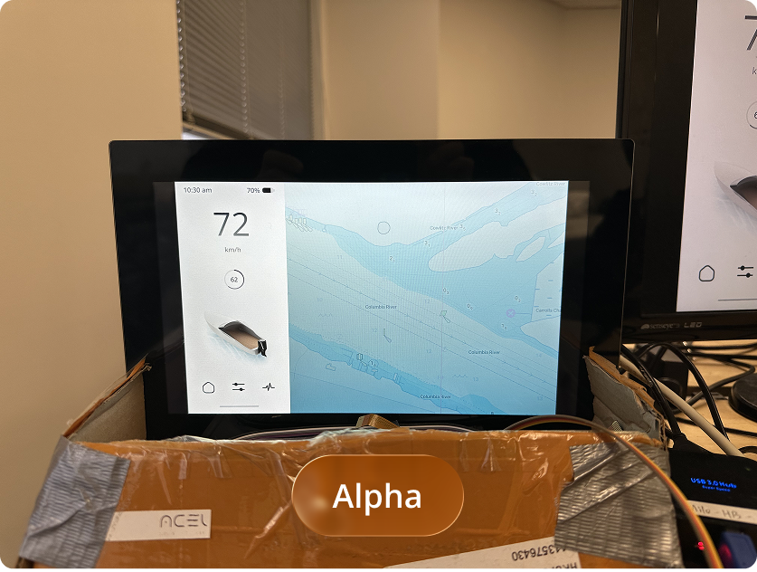
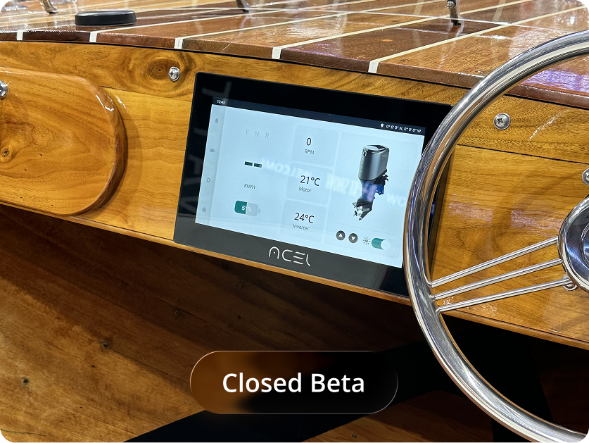
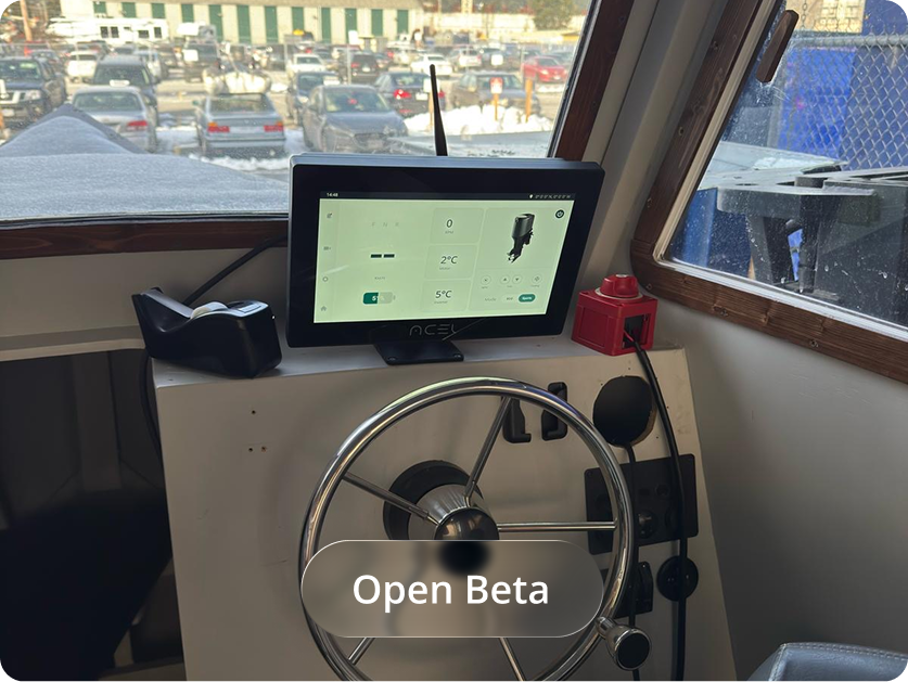
Designed and lead a full cycle product — Marine Human Machine Interface (HMI) Touchscreen Display, delivering real-time data for electric boat owners. Supports EV boaters with safety alarms, live status, and easy navigation.
Delivered a functional MVP in 5 months, accelerating business timeline by 45% from supporting leisure boats with a record speed of 41mph (66kmh) through electricfication.

.png)
.png)
.png)
Problem — boaters face range anxiety and limited real-time safety visibility.
As traditional controls become obsolete in the shift toward digitalization, the absence of real-time visibility results in poor user experiences.
.png)
.png)
How can we ensure these problems are real and worth solving?
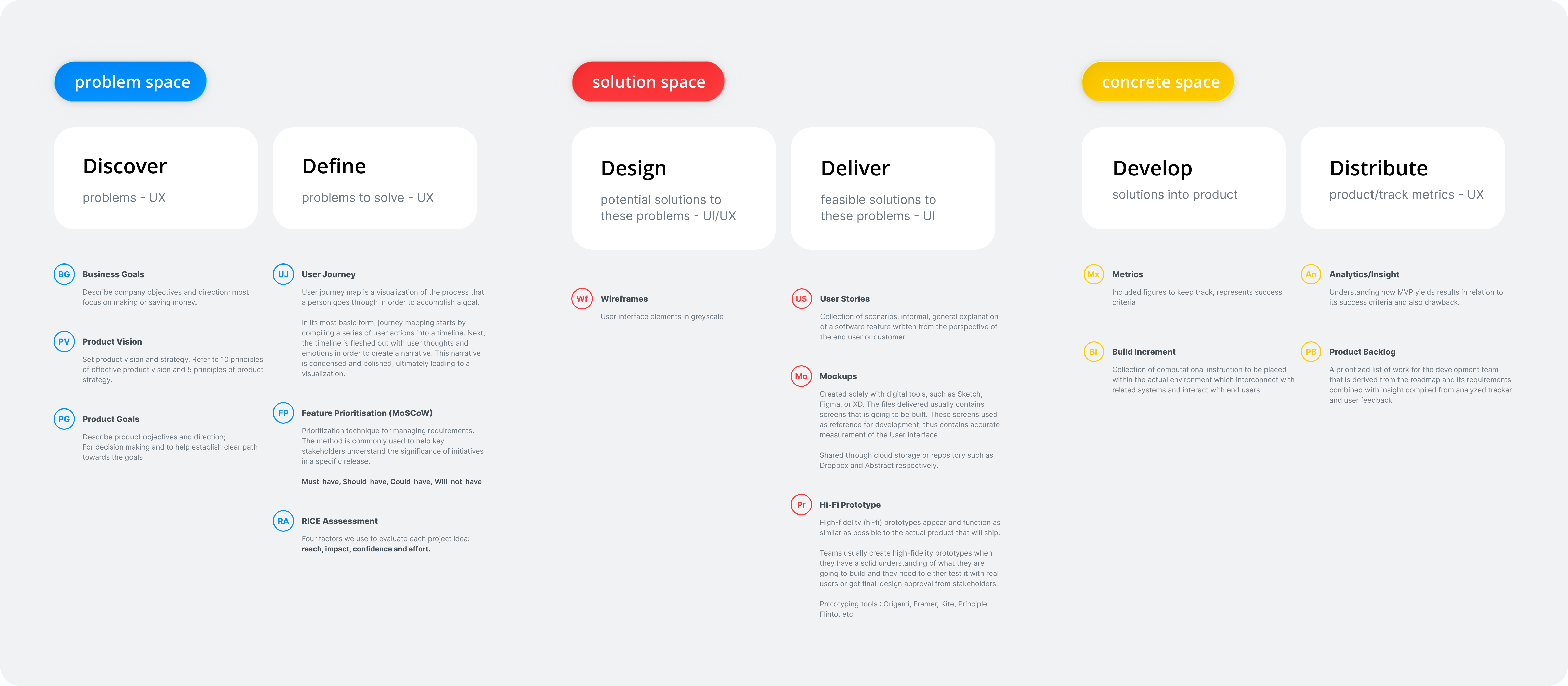
The product was launched from understanding business objectives, user objectives, and market opportunity. Our goal was to empathize with our customers to solve their pain points.
.png)
.png)
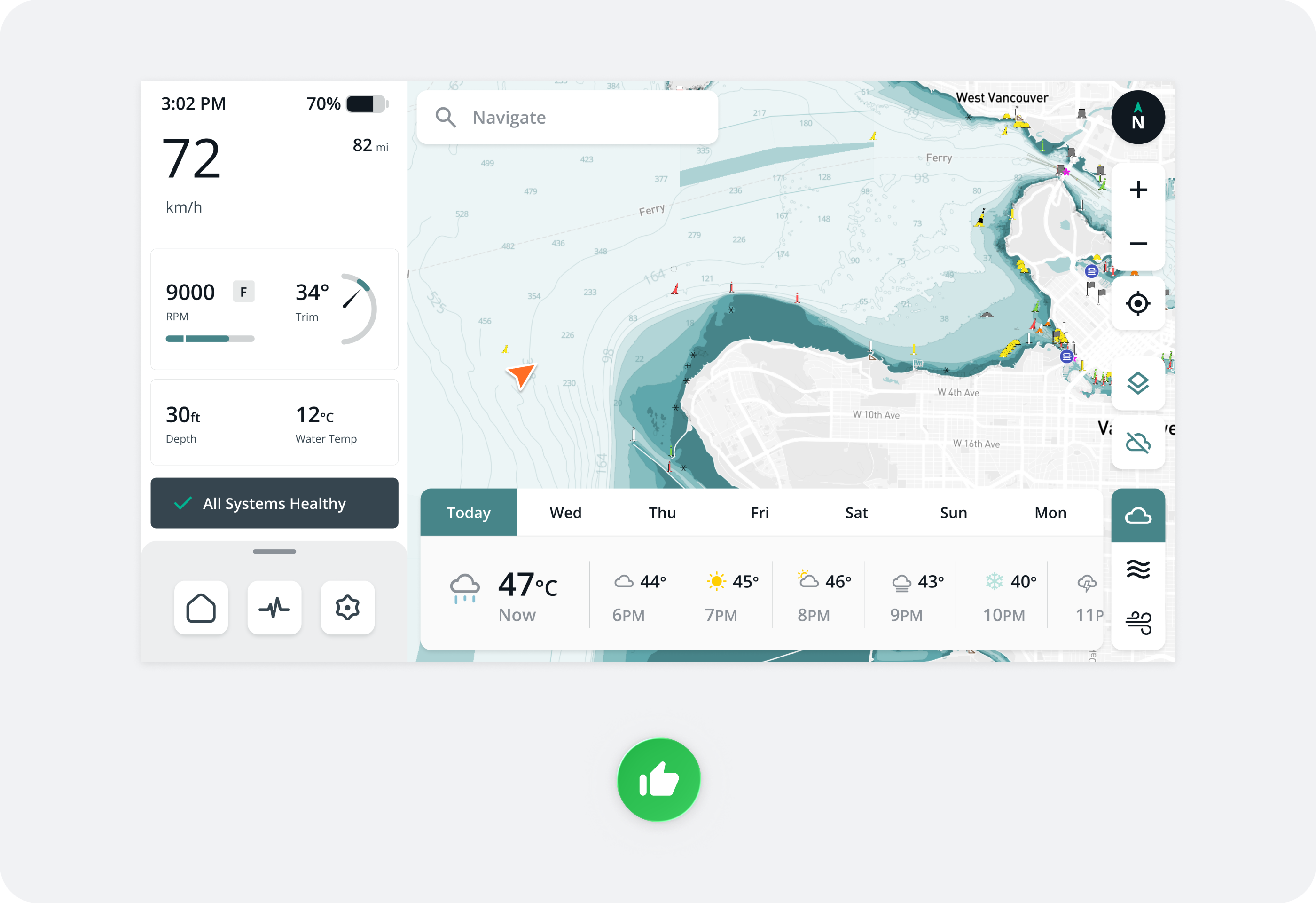
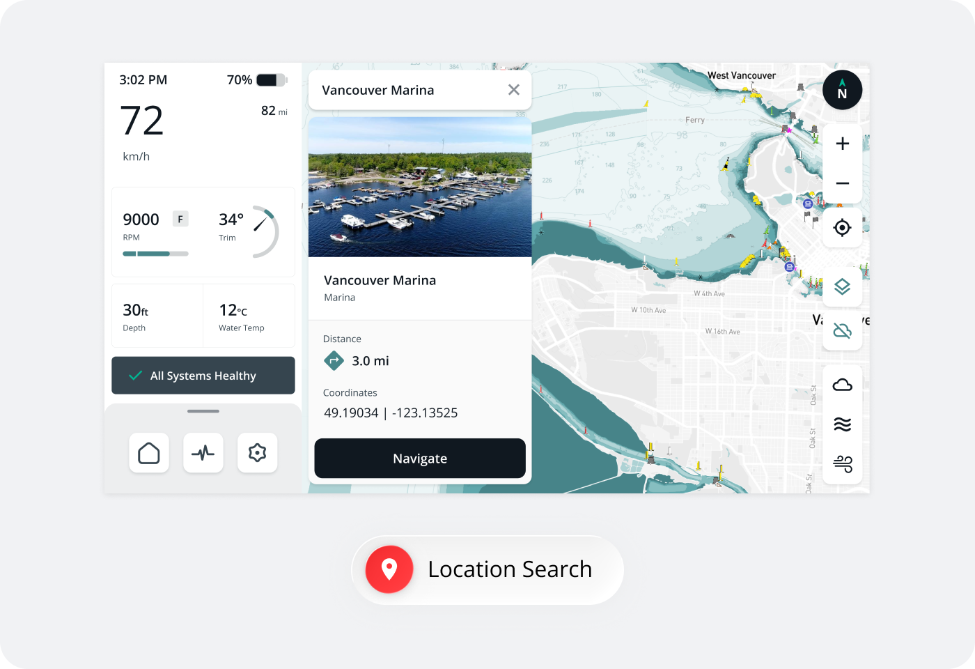
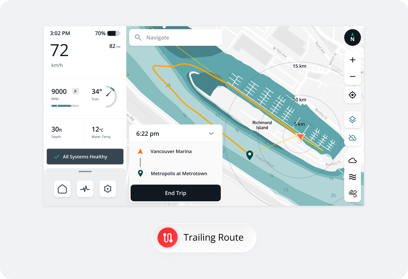
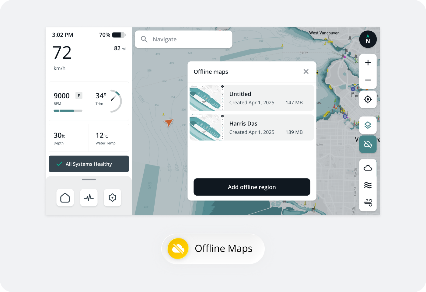
Solution — simplify the electric experience in one system.
Consolidating essential information into a unified system reduces user effort, enabling quicker access to key data and live status information while navigating.
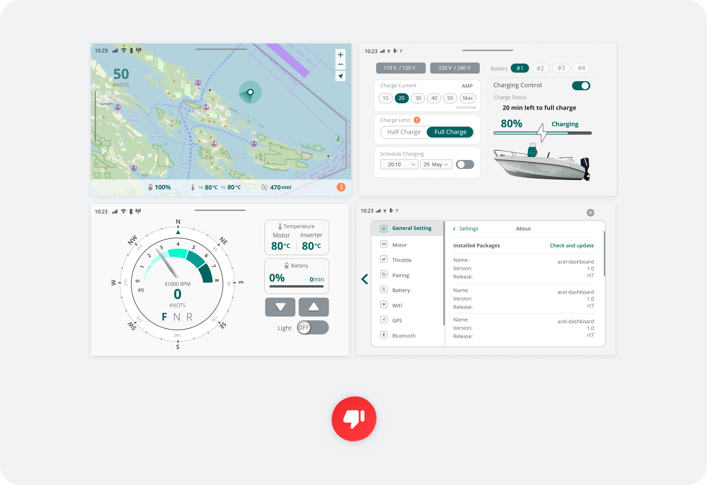
TLDR — provide boaters with their needs in one glance.
Simplifying the electric experience means removing unnecessary information that doesn’t add value, allowing users to focus on what truly matters.
The project involved 3 phases — research, design, and delivery. I led 3 software engineers to deliver a MVP in 5 months.
As product lead, I narrowed the scope as much as possible due to our limited time frame for a MVP. Our timeline included both user research (UX) and user interface (UI) design to ensure a user-centered approach.
We targeted recreational boaters who enjoy day cruising, so we prioritized comfort, safety, and low maintenance.
There were 3 generations that we studied — traditional, growth, and emerging boaters. Each generation had a different attitude towards EV boating. Our business users on the other hand, were boat builders, dealers, and distributors in the B2B ecosystem.
.png)
.png)
.png)
.png)
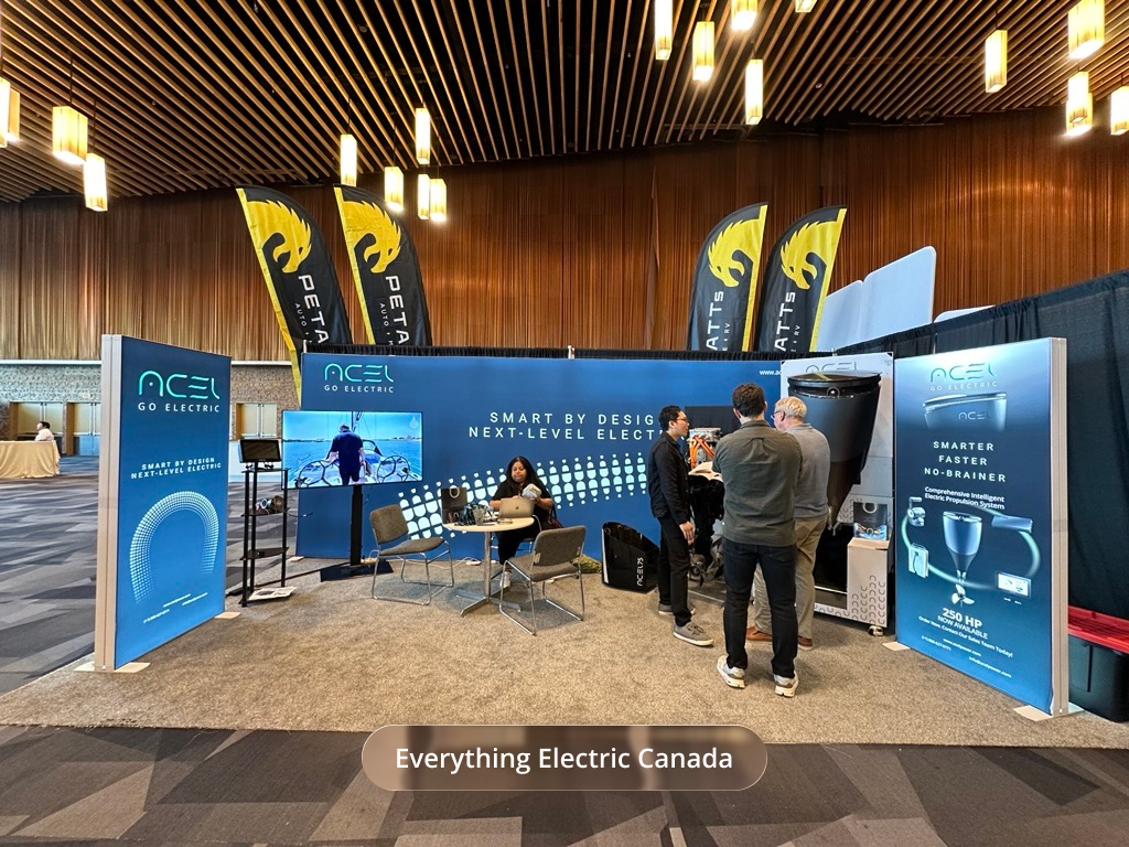
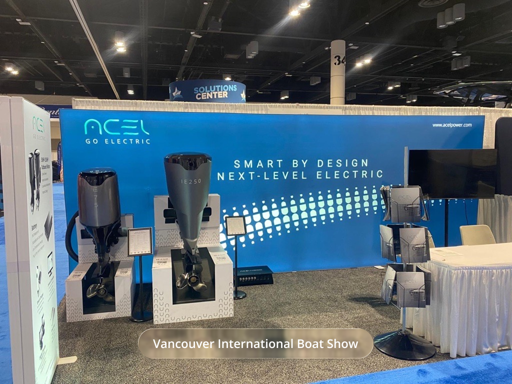
Understanding our competitors in the current market drove inspiration and curiousity.
Trade shows such as the Vancouver International Boat Show and Everything Electric Canada revealed industry standard and trendy designs, boosting our knowledge in a short amount of time. This allowed our team to think beyond the market and create our own unique solutions.
After research, we applied "How Might We" framing to drive brainstorming sessions after gathering user insights.
After conducting user interviews, card sorting emerged as the ideal strategy for organizing insights into categories. The goal was to facilitate group discussion to define and prioritize features for the MVP.
.png)
.png)
.png)
.png)
Again, the goal was to simplify the user experience. We ensured the flow was seamless.
The foundation was created by mapping the user flow and identifying all user entry points, gesture controls, call-to-actions, and exit points. This ensured everything was cohesive.
.png)
The goal wasn’t about perfecting one design, but a series of purposeful iterations that shaped a cohesive system.
My design process involved creating 3 types of wireframes: low, mid, and high fidelities. Mid-fidelity was introduced to better visualize how the product would feel within a systematic design approach.
.png)
.png)
.png)
.png)
.png)
Iterations was key. I believed in the little imperfections in the early stages.
I used trial and error to test designs, continuously improving through feedback and iteration. I kept my iterations organized so I could revisit and build on them later if needed.
.png)
.png)
Established a design system tailored for a touchscreen model.
I created a design system for visual consistency. Given the touch-screen interface, I ensured text was legible from a distance and buttons had a comfortable touch radius for good user feedback.
.png)
Assisted developers to match desired results.
Coordinated on little details such as defining px to dp/sp for our android application.
.png)
.png)
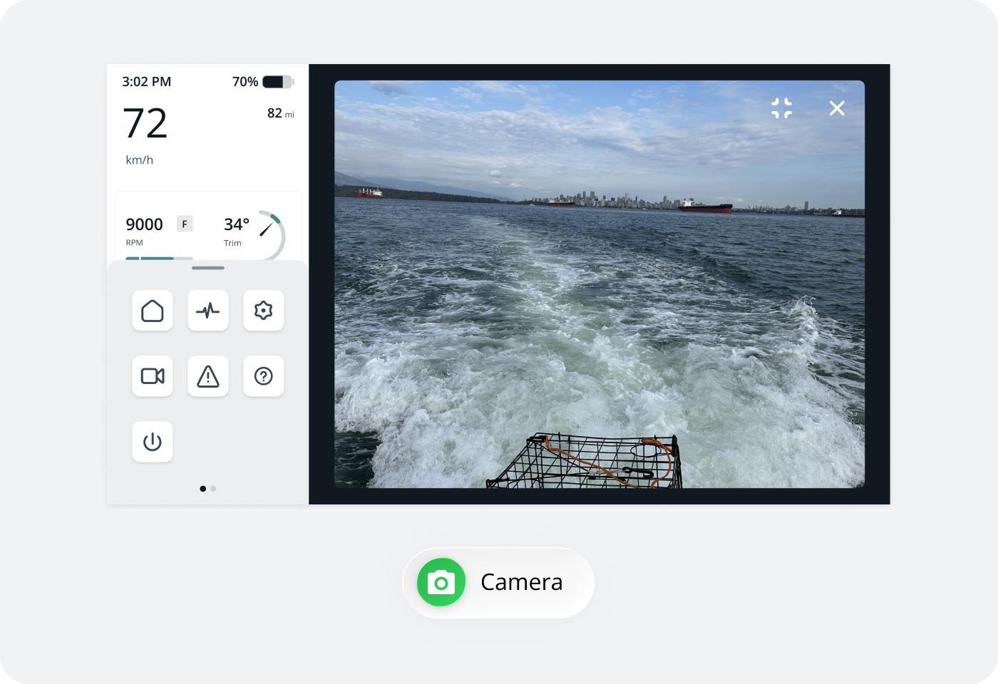
Our solution was to provide essentials, awareness, and safety for the user.
Ensured every decision was intentional and aligned with the business objective and solving the user's problem.
.png)
.png)
.png)
.png)
.png)
.png)
.png)
.png)
.png)
.png)
Our sea chart had unlimited ideas but we decided to keep it within scope.
Sometimes, part of the challenge is knowing when to set aside great ideas that may shine in a future version.
.png)
Sometimes, less is more — not all screens made it to MVP.
Some designs were discontinued because they were out of scope, resource-intensive, or offered low impact relative to the effort required.
.png)
.png)
Conducted multi-phase testing throughout the product development cycle to validate both functionality and user experience.
Legibility was crucial. For a touch-screen display to operate well, text and information must be legible from a certain distance. I focused on WCAG standards such as contrast, usability, and flow of the product.
.png)
Our users experienced anxiety, so we delievered a safety mechanism to restore confidence.
The value of this product ultimately brings safety, user awareness, and full control of our entire electric propulsion system. Without this product, there would be no way to monitor speed, range, or overheating.
Challenging, innovative, and fast-growing industry. This is the environment I love to grow as a designer — to continue improving human experiences on land or water.
This project pushed me to think beyond screens — to consider physical, environmental and systematic context. I learned that great product design means more than a good looking product; it’s about clear communication, trust, and control for users in high-stakes environments.
.png)
.png)
.png)
.png)
.png)